3. Spatial Mapping of NASS Corn Yield Data
I had prepared the necessary datasets of polygon and fips in order to do geographical mapping. These datasets will provide the backbone to carry out the mapping. Here, we will import data that contains the values to be mapped. I’ll use the corn yield data obtained from USDA Nass by using the api. I will refer to this dataset as “nass data” throughout the article. This dataset was already imported and saved as nass_all_states.csv on the hard drive.
If the polygon county data corresponding to county.fips2 obtained from the US Census Bureau were to be found, using county.fips2 would be more beneficial. Since it is more up-to-date than the county.fips present in the maps package. But for now, I will use the fips data from maps package, as it matches the polygon data, again provided by the same package.
Preparing Nass Corn Yield Data
library(stringr)
library(knitr)
library(tidyverse)
library(data.table)
library(DT)
library(RColorBrewer)

d = fread(str_c(files_dir, 'nass_all_states.csv'))
polygon_county = fread(str_c(files_dir, 'polygon_county.csv'))
polygon_state = fread(str_c(files_dir, 'polygon_state.csv'))

d[1:1000] %>% datatable()
d[, .N, .(state_alpha, state_name)] %>% datatable()
Nass data has the average yield of each county for each state. The states and the number of datapoints within each state is shown below. Since we don’t have polygin data for Hawaii, Hawaii will be taken out. Its number of entries is negligible anyway.
Now, we will go through some cleaning. Data points between 1980-2016 are taken for the analysis. At the end, only the necessary variables for the analyis will be retained.
setnames(d, c('state_name', 'county_name', 'Value'), c('state', 'county', 'value') )
d = d[ year %in% seq(1980,2016) & agg_level_desc == 'COUNTY']

d = d %>% select(state, county, year, value)
x = d %>%
    select(state, county) %>%
    as.data.frame() %>%
    map_df(.f = str_to_lower) %>%
    map_df(.f = str_replace_all, pattern = '[[:punct:]]', replacement = '') %>%
    map_df(.f = str_replace_all, pattern = '[[:space:]]', replacement = '') %>%
    as.data.table()
d[, `:=`(state = x$state, county = x$county)]
d = d[county != 'othercombinedcounties']


# Check for suffixes
d_city = d[county %>% str_detect('city'), .SD]
d_city %>% datatable()
d_borough = d[county %>% str_detect('borough'), .SD]
d_borough ## Empty data.table (0 rows) of 4 cols: state,county,year,valued_county = d[county %>% str_detect('county'), .SD]
d_county ## Empty data.table (0 rows) of 4 cols: state,county,year,valued_parish = d[county %>% str_detect('parish'), .SD]
d_parish ## Empty data.table (0 rows) of 4 cols: state,county,year,valued_muni = d[county %>% str_detect('municip'), .SD]
d_muni ## Empty data.table (0 rows) of 4 cols: state,county,year,valued_main = d[county %>% str_detect('main'), .SD]
d_main## Empty data.table (0 rows) of 4 cols: state,county,year,valued_saint = d[county %>% str_detect('saint'), .SD]
d_saint %>% datatable()In VA, only James City, and Charles City will keep their “city” suffixes, and all “saint”s will be converted to “st”.
# Clean "saint"
d$county = d$county %>%
    str_replace_all(pattern = 'saint', 'st')

# Clean "city"
va = d[state %in% 'virginia', ][, row_id := .I]

va2 = va %>%
    select(state, county, row_id) %>%
    filter(state == 'virginia') %>%
    filter(county %in% c('jamescity', 'charlescity'))

va3 = va %>%
    select(state, county, row_id) %>%
    filter(state == 'virginia') %>%
    filter(!county %in% c('jamescity', 'charlescity')) %>%
    map_df(.f = str_replace_all, pattern = 'city', '') %>%
    rbind(va2) %>%
    arrange(as.integer(row_id)) %>%
    as.data.table()

d[state %in% 'virginia', county := va3$county]

# Get rid of duplicated records
d = d[!duplicated(d)]

d = d[!is.na(year)]

d = d[order(state, county, year)]
d[1:1000] %>% datatable()
Nass data is clean and ready to be combined with polygon and fips data.
d = left_join(d, polygon_county) %>% as.data.table()
d[is.na(fips)] %>% datatable()
d[, `:=`(year = as.integer(year),
value = as.numeric(value))]
d = na.omit(d)All the counties now have their corresponding lat, long and fips data, except for two: Chesapeake, Virginia and Oglalalakota, South Dakota. I have no idea why these are not present in the polygon_county dataset, but that’s beyond me.
We will also calculate the mean yield for each year in each state. This will allow us to plot the average yield of states throughout the years.
d_avg_state = d[, .(value_state = mean(value)), by = .(state, year)]
d_state = left_join(d_avg_state, polygon_state) %>% as.data.table()
d[1:1000] %>% datatable(caption = 'County Yield')
d_state[1:1000] %>% datatable(caption = 'State Yield')Now we have two datasets: d, which is the county yield data, and d_state which is the state yield data, and are ready for doing the thing that we wanted to do all along: geographical mapping.
Mapping State Level Data
ggplot(data = polygon_state, mapping = aes(x = long, y = lat, group = group)) +
    geom_polygon(fill = 'ivory1', color = "black", size = 0.1) +
    coord_map('mercator') +
    theme_bw()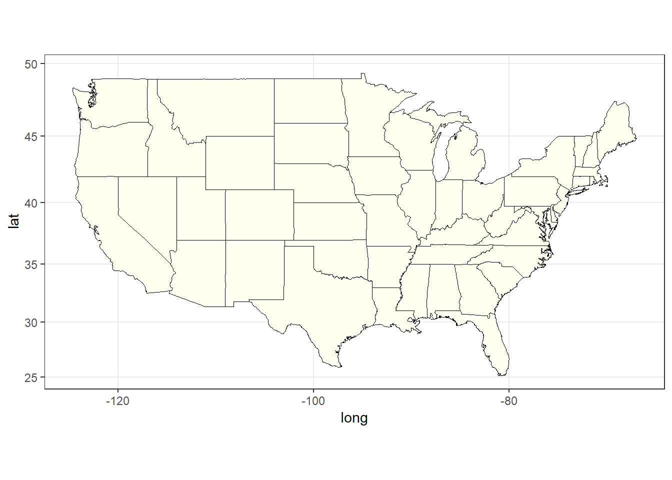
Figure 1: The plain state map of USA
numdata = polygon_state[, .(unique(state))][,.N]
pal = brewer.pal(name = 'Accent', n = 8)
colors = colorRampPalette(pal)
colors = colors(numdata)

ggplot(data = polygon_state, mapping = aes(x = long, y = lat, group = group)) +
    geom_polygon(aes(fill = state), color = "black", size = 0.1) +
    scale_fill_manual(values = colors, guide = FALSE) +
    coord_map('mercator') +
    theme_bw()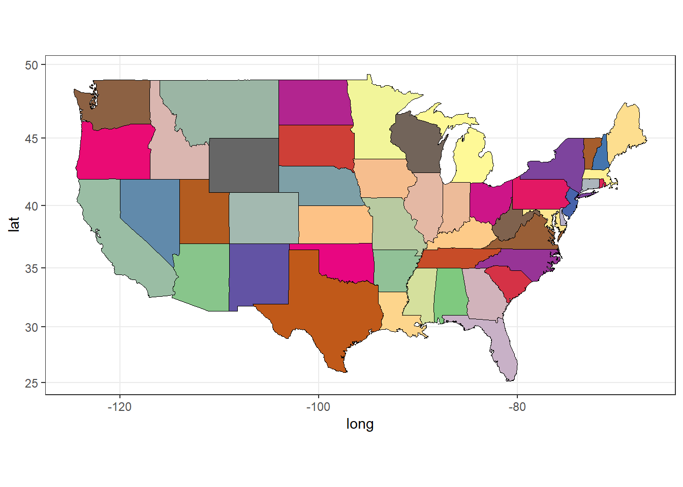
Figure 2: The colored state map of USA
Labelling the States
When we produce a spatial plot, we might need to show the names of places. Here we will label the states on the state map, and show them at their corresponding state centers. For this purpose, we will make use of the center_state data we computed before.
Here since some states have peninsulas, and/or islands we will first have to get their main parts. Otherwise, the names will be plotted on each of these separate areas, which will clutter the map. It will already be cluttered in the Northeast part of US where there are many small states neighbouring each other.
center_state = fread(str_c(files_dir, 'center_state.csv'))
center_state %>% datatable()
center_main = center_state[state %in% c('newyork','northcarolina', 'virginia', 'washington', 'massachusetts') & county == 'main' |
state == 'michigan' & county == 'south']
center_state = rbind(center_state[county %in% ''], center_main)ggplot(data = polygon_state, mapping = aes(x = long, y = lat, group = group)) +
geom_polygon(aes(fill = state), color = "black", size = 0.1) +
geom_text(data = center_state, aes(x = long, y = lat, label = state), size = 3) +
scale_fill_discrete(guide = FALSE) +
coord_map('mercator') +
theme_bw()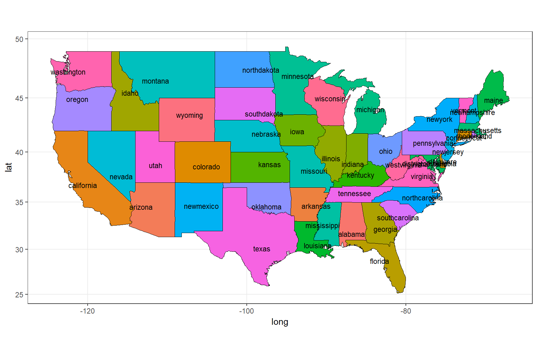
Figure 3: Labelling the states using state_center data
ggplot(data = d_state[year == 2016], mapping = aes(x = long, y = lat, group = group)) +
    geom_polygon(aes(fill = value_state), color = "black", size = 0.1) +
    geom_polygon(data = polygon_state, col = 'black', fill = NA) +
    scale_fill_gradientn(name = 'Yield bu/ac', colors = brewer.pal(n = 11, name = 'RdYlGn')) +
    coord_map('mercator') +
    theme_bw()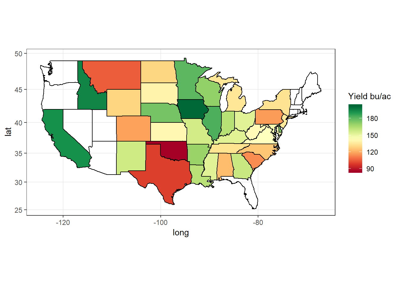
Figure 4: State average corn yield in bushels per acre (bu/ac) for the year 2016
ggplot(data = d_state[year %between% c(1980, 2015)], mapping = aes(x = long, y = lat, group = group)) +
    geom_polygon(aes(fill = value_state), color = "black", size = 0.1) +
    geom_polygon(data = polygon_state, col = 'black', fill = NA) +
    scale_fill_gradientn(name = 'Yield bu/ac',
        colors = brewer.pal(n = 11, name = 'RdYlGn')) +
    facet_wrap(~year, ncol = 3) +
    coord_map('mercator') +
    theme_bw()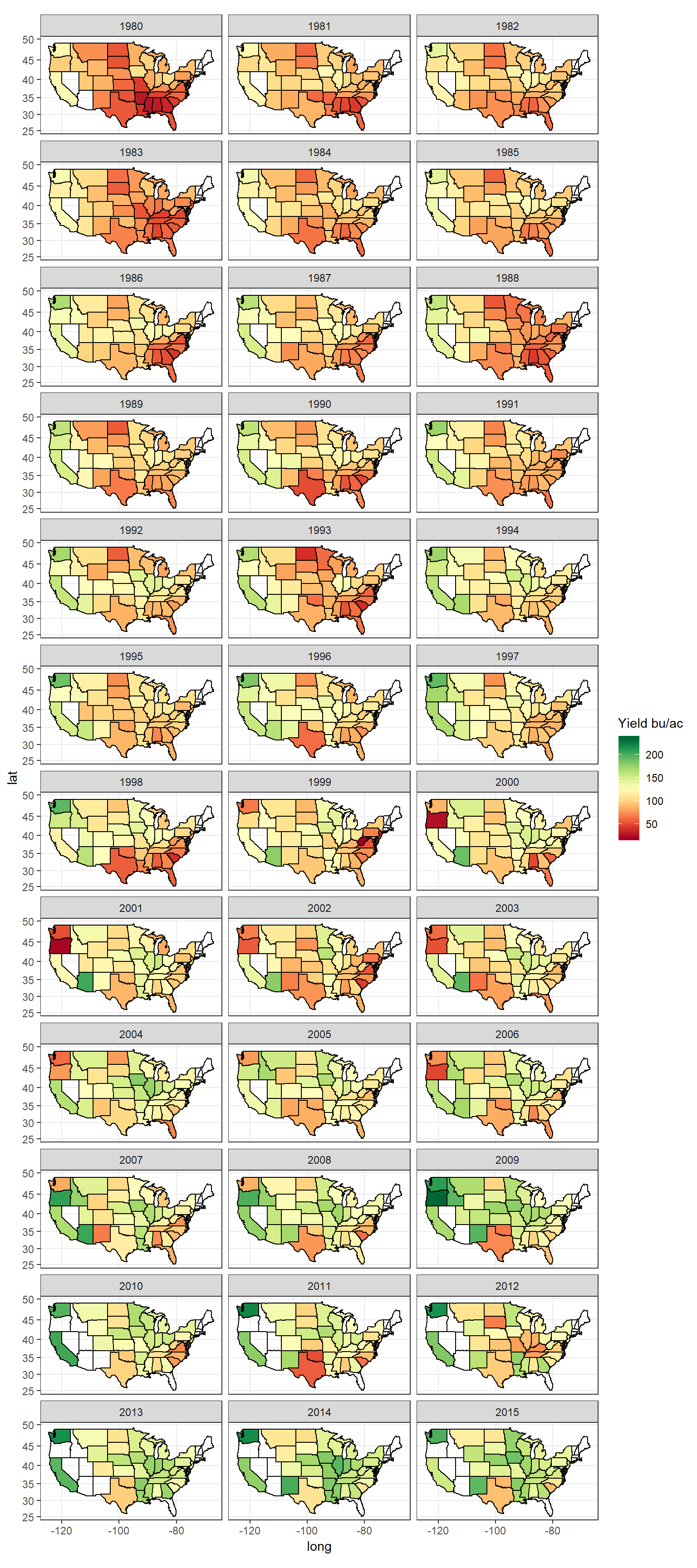
Figure 5: State average corn yield, years 1980 - 2015
Mapping state average corn yield can give an overall idea of the production. However, it can also be grossly misleading as even if there is only 1 county having yield data, it will seem like thw whole state is producing corn. Instead checking the county yield data can be more useful.
Mapping County Level Data
ggplot(data = polygon_county, mapping = aes(x = long, y = lat, group = group)) +
    geom_polygon(fill = 'ivory1', color = "black", size = 0.05) +
    coord_map('mercator') +
    theme_bw()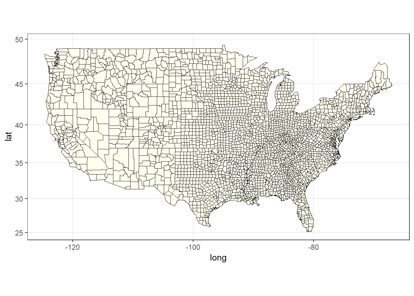
Figure 6: The plain county map of USA
ggplot(data = d[year == 2016], mapping = aes(x = long, y = lat, group = group)) +
    geom_polygon(aes(fill = value), color = NA, size = 0.1) +
    geom_polygon(data = polygon_state, col = 'black', fill = NA, size = 0.1) +
    scale_fill_gradientn(name = 'Yield bu/ac',
        colors = brewer.pal(n = 11, name = 'RdYlGn')) +
    coord_map('mercator') +
    theme_bw()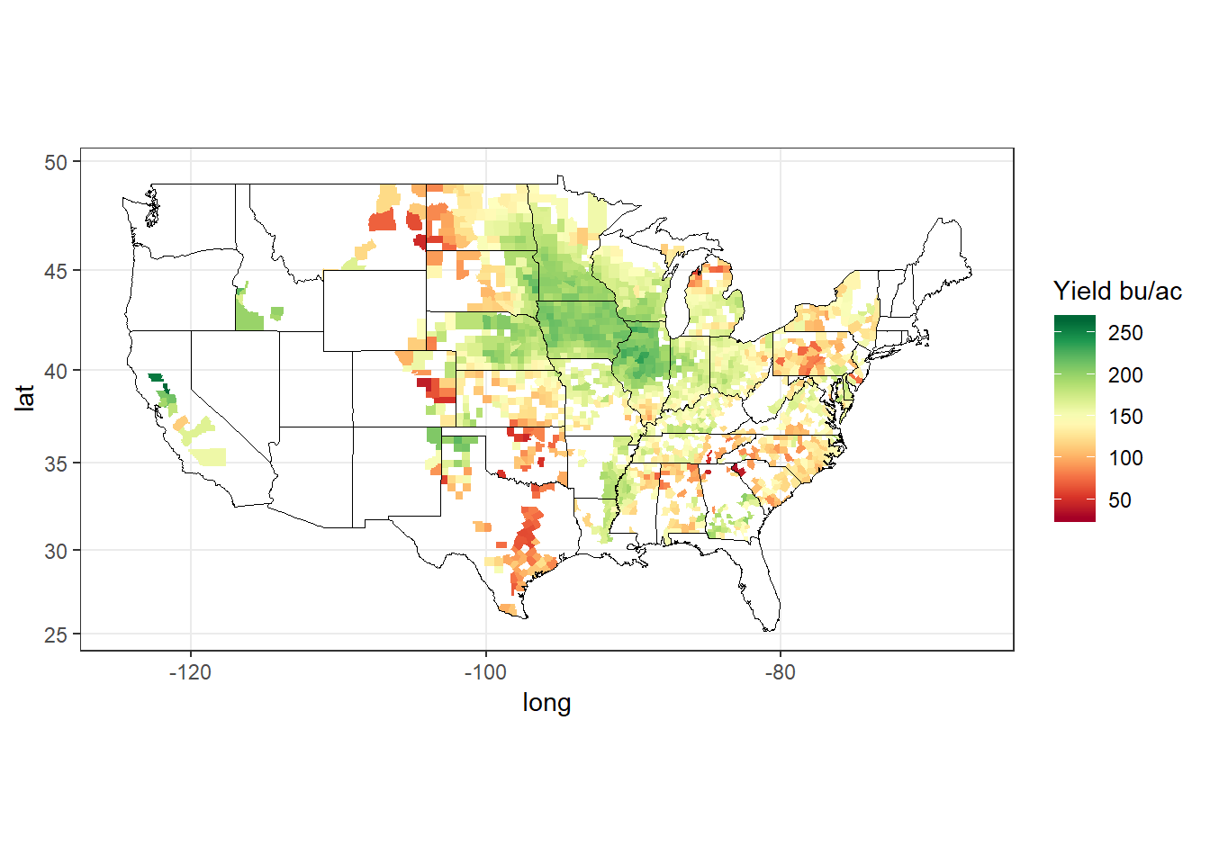
Figure 7: County yield map for the year 2016
As can be seen, some states have only a few counties of corn yield data, which could not be seen with state level yield maps.
ggplot(data = d[year == 2016 & state == 'missouri'],
    mapping = aes(x = long, y = lat, group = group)) +
    geom_polygon(aes(fill = value), color = "black", size = 0.1) +
    geom_polygon(data = polygon_state[state == 'missouri'], col = 'black', fill = NA) +
    scale_fill_gradientn(name = 'Yield bu/ac',
        colors = brewer.pal(n = 11, name = 'RdYlGn')) +
    coord_map('mercator') +
    theme_bw()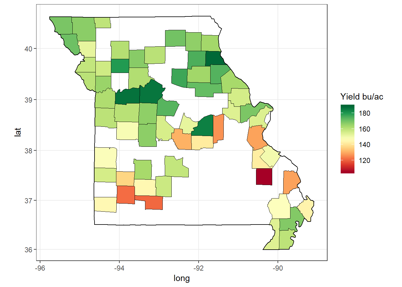
Figure 8: Corn yield of counties in a single state, Missouri, for 2016
ggplot(data = d[year %between% c(1980, 2015) & state == 'missouri'], mapping = aes(x = long, y = lat, group = group)) +
    geom_polygon(aes(fill = value), color = NA, size = 0.1) +
    geom_polygon(data = polygon_state[state == 'missouri'], col = 'black', fill = NA) +
    scale_fill_gradientn(name = 'Yield bu/ac',
        colors = brewer.pal(n = 11, name = 'RdYlGn')) +
    coord_map('mercator') +
    facet_wrap(~year, ncol = 4) +
    theme_bw()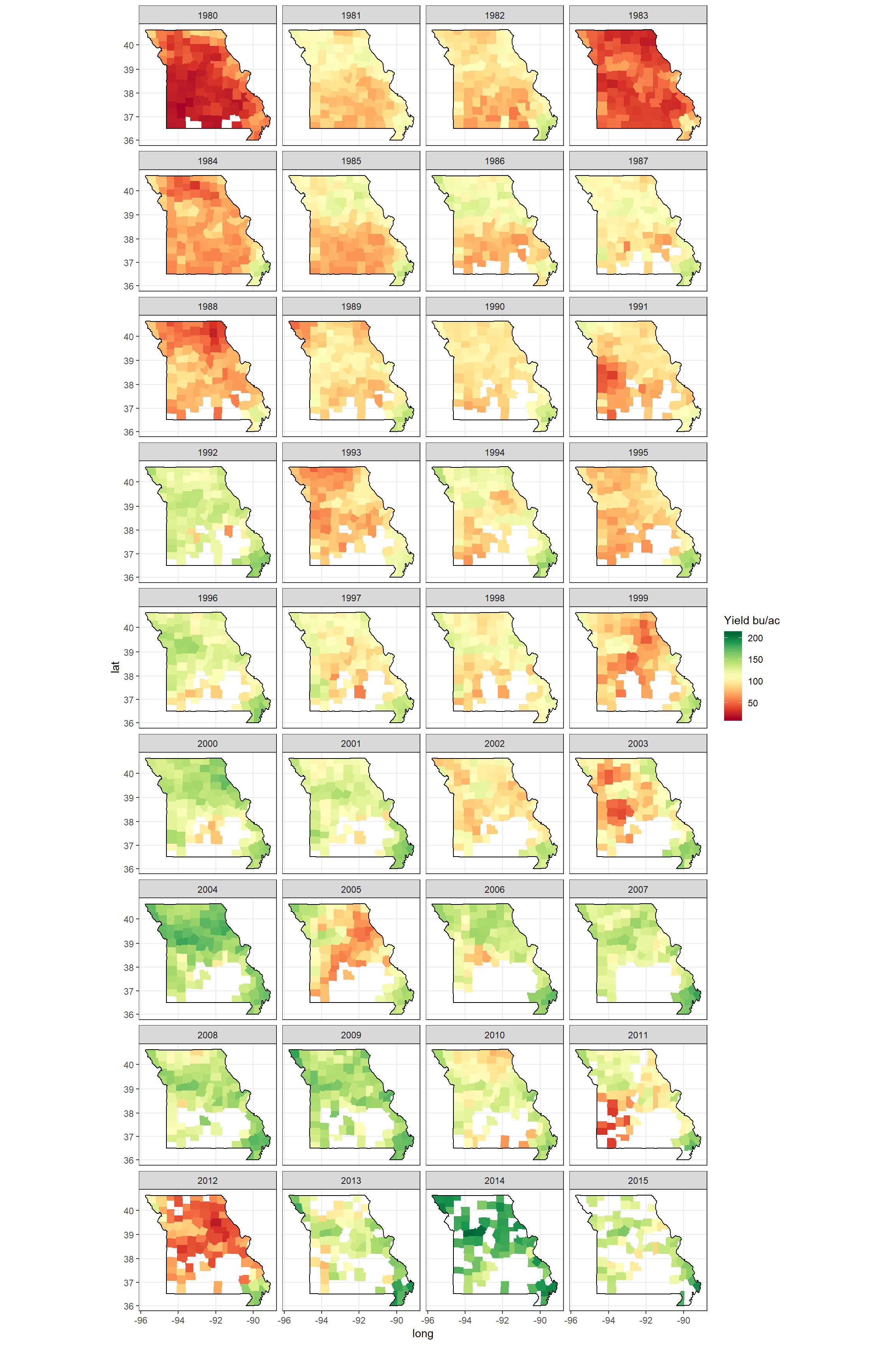
Figure 9: Corn yield of counties in a single state, Missouri, between 1980 - 2015
Maps of a Region: MidWest
We have mapped all states county yield data, and also single state county yield data. As can be guessed we can also map several states. It can be seen that the Mid-West has generally the highest average yield among all states. So let’s only analyze the Mid-West.
midwest = c('northdakota', 'southdakota', 'nebraska', 'kansas', 'missouri', 'illinois',
            'iowa', 'minnesota', 'wisconsin', 'indiana', 'michigan', 'ohio')

numdata = length(midwest)
pal = brewer.pal(name = 'Set1', n =11)
colors = colorRampPalette(pal)
colors = colors(numdata)

ggplot(data = polygon_state[state %in% midwest],
       mapping = aes(x = long, y = lat, group = group)) +
    geom_polygon(aes(fill = state), color = "black", size = 0.1) +
    geom_text(data = center_state[state %in% midwest],
              aes(x = long, y = lat, label = state), size = 3) +
    scale_fill_manual(values = colors, guide = FALSE) +
    coord_map('mercator') +
    theme_bw()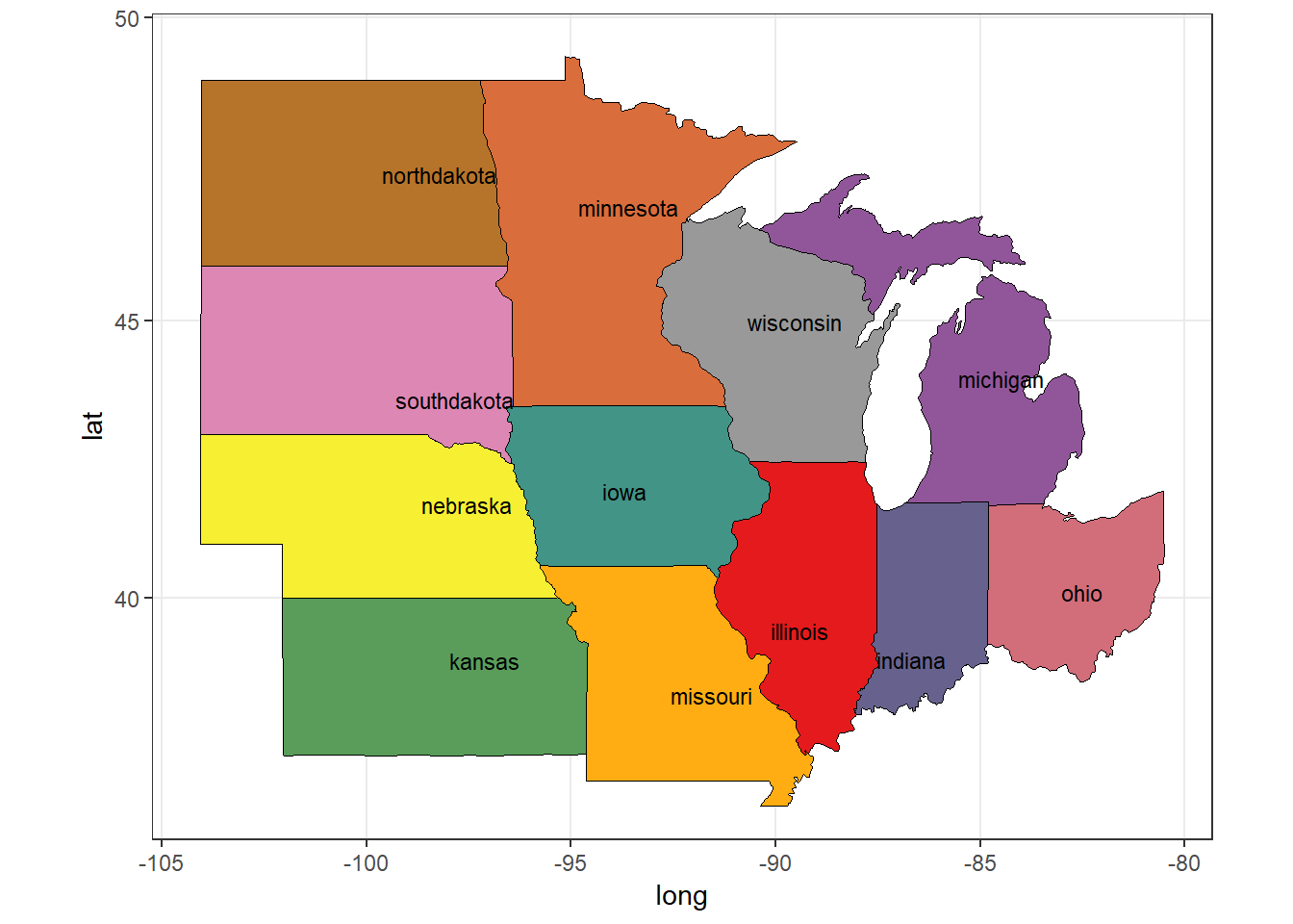
Figure 10: US Mid-West States
So these are the states that constitute the Mid-West USA. We have made use of center_state data we computed before.
ggplot(data = d[year %between% c(1980, 2015) & state %in% midwest],
       mapping = aes(x = long, y = lat, group = group)) +
    geom_polygon(aes(fill = value), color = NA, size = 0.1) +
    geom_polygon(data = polygon_state[state %in% midwest],
                 col = 'black', fill = NA, size = 0.1) +
    scale_fill_gradientn(colors = brewer.pal(n = 11, name = 'RdYlGn')) +
    coord_map('mercator') +
    facet_wrap(~year, ncol = 4) +
    theme_bw()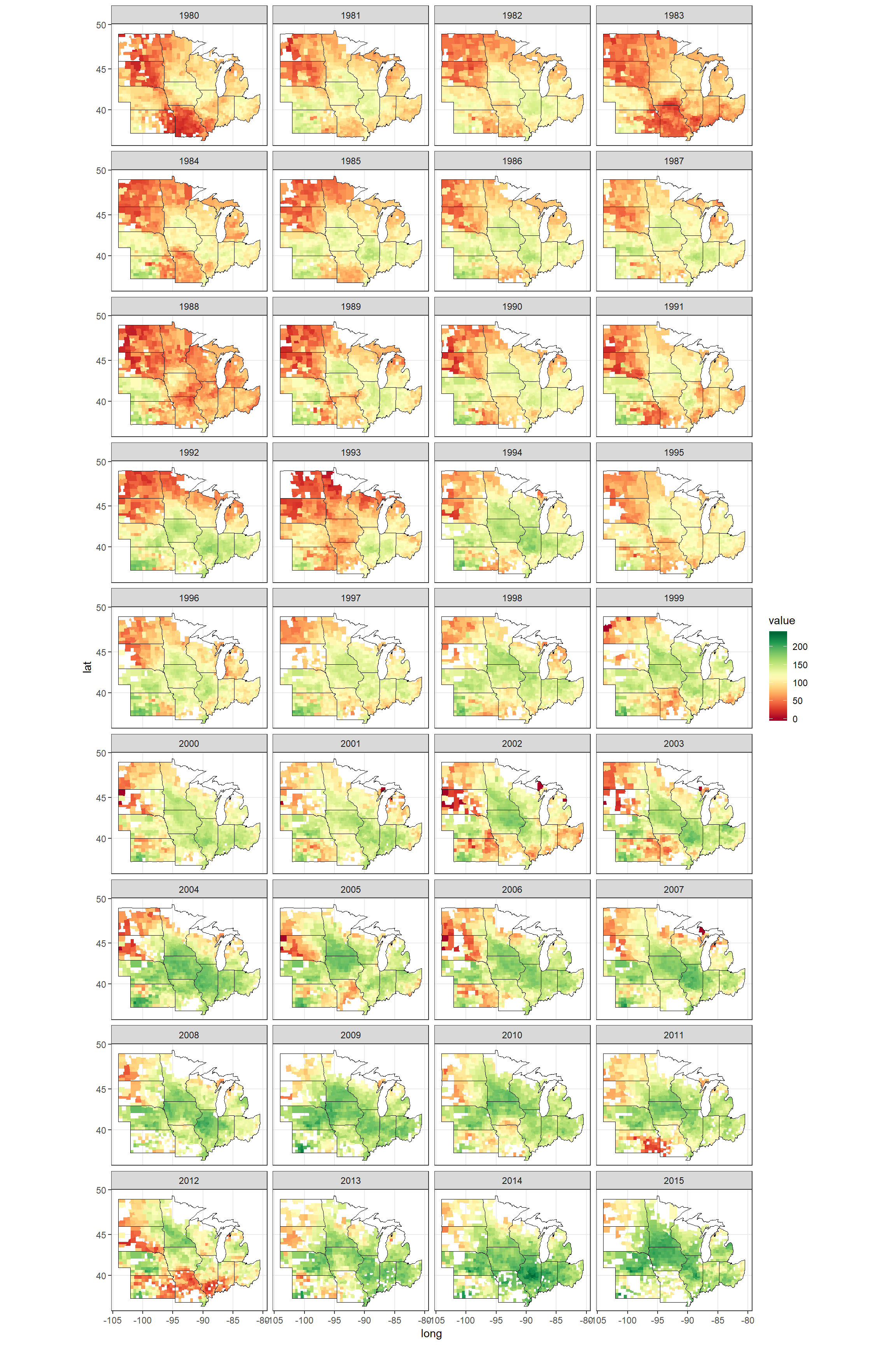
Figure 11: Corn yield of counties in the MidWest, between 1980 - 2015
So that’s it. We have achieved to succesfully import, clean and join the polygon, fips, and the nass datasets. Then, we have used these datasets to produce various geographical maps. The visualization of such spatial data can provide great insights into understanding and developing models.