4. Geographical Mapping Using Fips Data
We have done geographical mapping by joining the names of the places, whose values are to be mapped, with the polygon data of latitudes and longitudes. Here, we didn’t make use of the fips data. In some datasets, only fips is provided without place names. In this article we will make use of the fips that we had integrated into the polygon data.
library(stringr)
library(knitr)
library(tidyverse)
library(data.table)
library(DT)

polygon_county = fread(str_c(files_dir, 'polygon_county.csv'))
polygon_state = fread(str_c(files_dir, 'polygon_state.csv'))
center_state = fread(str_c(files_dir, 'center_state.csv'))
center_county = fread(str_c(files_dir, 'center_county.csv'))
Unemployment Data
The unemployment dataset unemp in the maps package has the fips code, population, and unemployment rates for each county in 2009.
library(maps)
data(unemp)
unemp %>% datatable()
unemp = as.data.table(unemp)
unemp = left_join(polygon_county, unemp) %>% as.data.table()
unemp[1:1000] %>% datatable(rownames = F)As can be seen, joining this dataset with polygon data is much easier, because there is no need to do cleaning for names to match. It also decreases mismatching of names with their polygons (to maybe 0%?).
USA Unemployment and Population Maps
ggplot(data = unemp, mapping = aes(x = long, y = lat, group = group)) +
    geom_polygon(aes(fill = unemp), color = NA, size = 0.1) +
    geom_polygon(data = polygon_state, col = 'black', fill = NA, size = 0.1) +
    scale_fill_gradientn(colours = c('limegreen', 'yellow1', 'red1')) +
    coord_map('mercator') +
    theme_bw()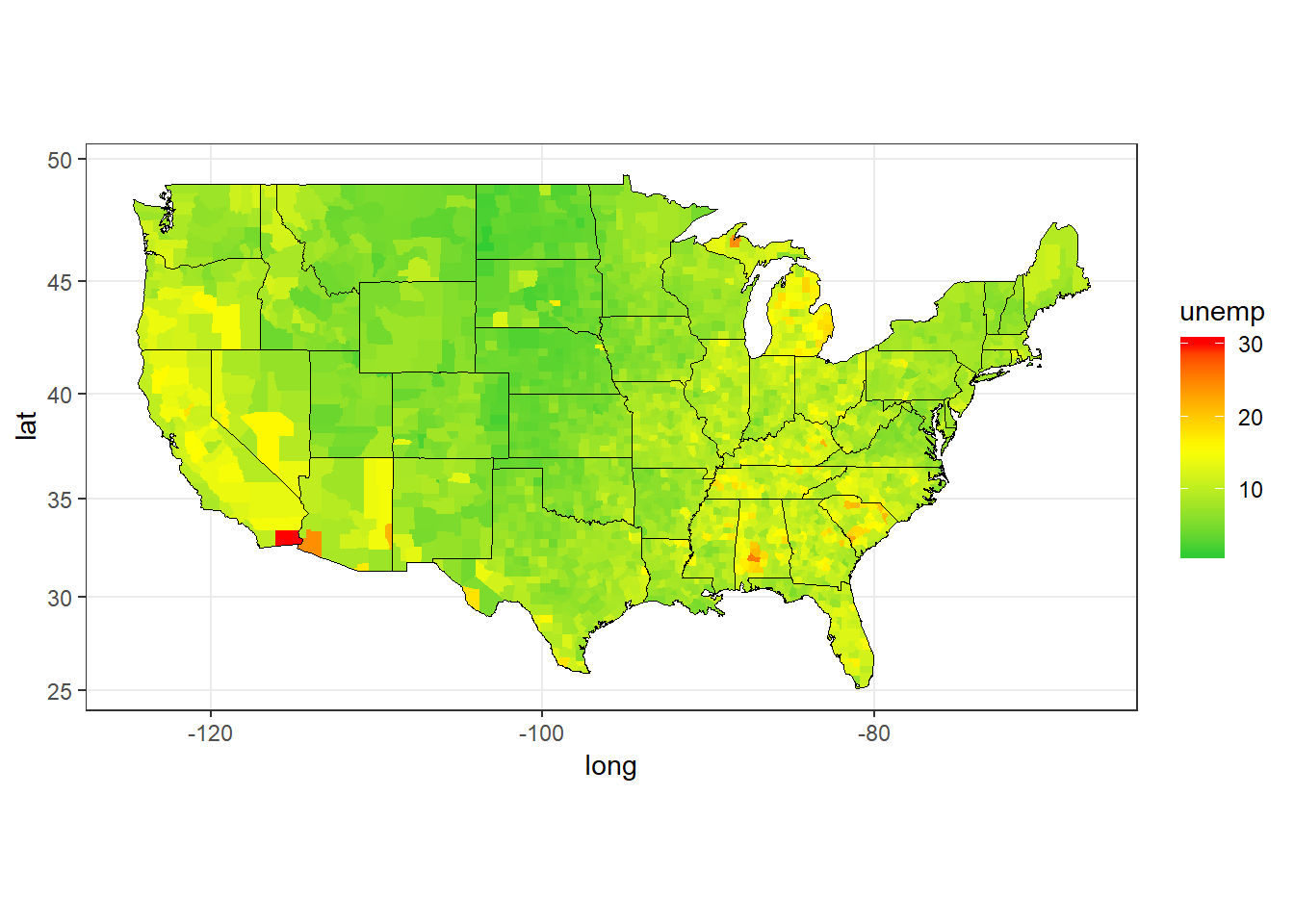
Figure 1: USA Unemployment Rates by County, 2009
Since the majority of unemployment rate is around 10%, and only a few are very high, the distribution is not nicely seen. Taking the log of the data might help to distingusih between the counties.
lowest_unemp = unemp[, .(state_avg_unemp = mean(unemp)), by = state][order(state_avg_unemp)][1:10]

ggplot(data = unemp, mapping = aes(x = long, y = lat, group = group)) +
    geom_polygon(aes(fill = log(unemp)), color = NA, size = 0.1) +
    geom_polygon(data = polygon_state, col = 'black', fill = NA, size = 0.1) +
    geom_text(data = center_state[state %in% lowest_unemp$state],
              aes(x = long, y = lat, label = state), size = 3) +
    scale_fill_gradientn(colours = c('limegreen', 'yellow1', 'red1')) +
    coord_map('mercator') +
    theme_bw()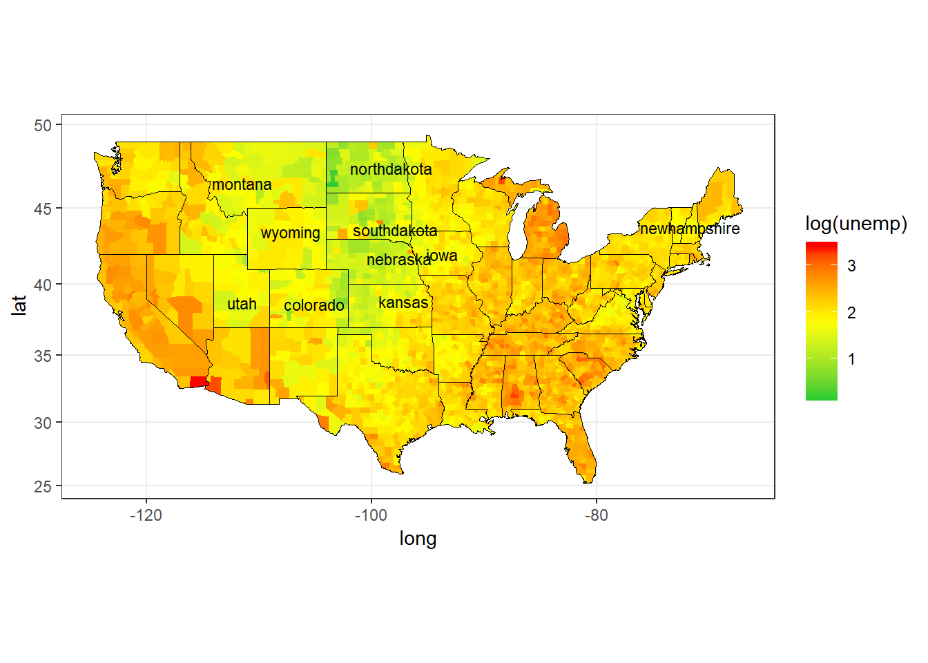
Figure 2: USA Unemployment Rates (Log) by County, 2009
Ok. That’s better. I have also labelled 10 states with the lowest average unemployment rate. The Mid-West-North part of Usa dominates the rankings.
Let’s also check the population map. Since using the nominal values again produced not so useful map, I have taken the log to make the visualization better.
ggplot(data = unemp, mapping = aes(x = long, y = lat, group = group)) +
    geom_polygon(aes(fill = log(pop)), color = 'black', size = 0.1) +
    geom_polygon(data = polygon_state, col = NA, fill = NA, size = 0.1) +
    scale_fill_gradientn(colours = c('red1', 'yellow1', 'forestgreen')) +
    coord_map('mercator') +
    theme_bw()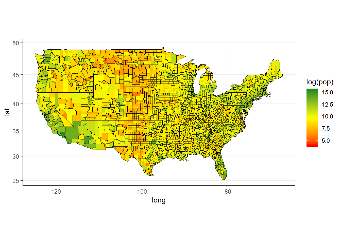
Figure 3: USA Population (Log) by County, 2009
This time I have drawn the border lines of the counties, instead of the states only. Doing this might not fit your taste, as the map becomes quite cluttered.
Some large areas such as the NorthEast, West Coast, and Southern Florida stick out to be high population areas.
Missouri Unemployment and Population Maps
ggplot(data = unemp[state == 'missouri'], mapping = aes(x = long, y = lat, group = group)) +
    geom_polygon(aes(fill = unemp), color = 'black', size = 0.1) +
    geom_polygon(data = polygon_state[state == 'missouri'], col = NA, fill = NA, size = 0.1) +
    geom_text(data = center_county[state %in% 'missouri'],
              aes(x = long, y = lat, label = county), size = 2) +
    scale_fill_gradientn(colours = c('limegreen', 'yellow1', 'red1')) +
    coord_map('mercator') +
    theme_bw()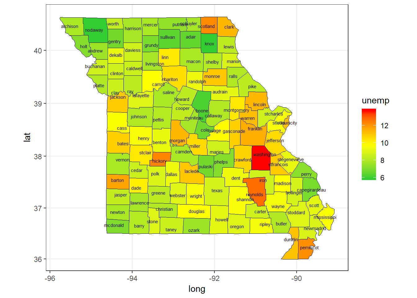
Figure 4: Missouri Unemployment Rate by County, 2009
ggplot(data = unemp[state == 'missouri'], mapping = aes(x = long, y = lat, group = group)) +
    geom_polygon(aes(fill = log(pop)), color = NA, size = 0.1) +
    geom_polygon(data = polygon_state[state == 'missouri'], col = 'black', fill = NA, size = 0.1) +
        geom_text(data = center_county[state %in% 'missouri'],
              aes(x = long, y = lat, label = county), size = 2) +
    scale_fill_gradientn(colours = c('limegreen', 'yellow1', 'red1')) +
    coord_map('mercator') +
    theme_bw()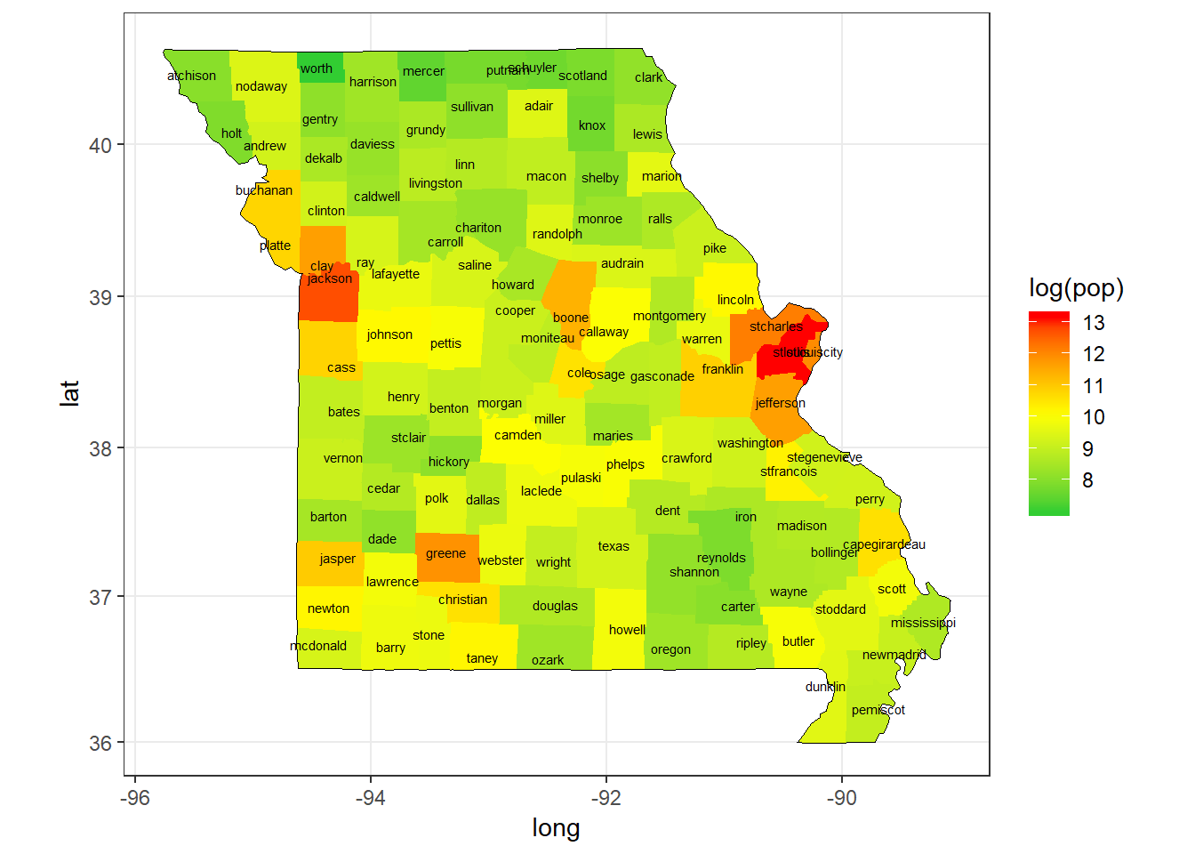
Figure 5: Missouri Population (Log) by County, 2009
When we check only Missouri, we can see that Washington County has the highest unemployment rate. Population wise St Louis County is the winner, followed by Jackson County (Kansas City).